Charity, design and people
It’s about being professional
Third sector and charity organisations are in many ways like businesses. They have a role to play in the lives of others and that comes with responsibility, duty and purpose. They have a product and service that either people need or require to solve a problem. They also hold financial responsibility for all work procured.
The fundamental differences between the two, however, is usually budget. Spending public money comes with huge responsibilities and that includes employees, service providers and donors. To see any money wasted or poorly spent is a failure of charity leaders and its trustees and the confidence of the private sector wains. However, a budget must be allocated. Free work simply does not provide tangible results.
All creative work has to be completed within a professional contract. A written brief must be produced to direct the work to a successful conclusion and in a desired time frame.
From my experience
As a creative working with third sector clients a certain mindset is required. Patience is one of them. The decision making process usually takes longer. Generally, businesses are more assertive and have a good sense of direction. Furthermore, trustees usually need to be involved in the bigger projects. CEO’s and boards of trustees tend to have a more global overview and often have much to contribute to the approval process. Naturally this takes time.
Although broad consultation can be frustrating for some, the feedback is usually very good and changes that are being asked for are often well based. Design and marketing can at times be fickle. Yet if a more global and long term approach be encouraged, it is usually right.
Three examples
Here are three examples of work I have completed to show the positive outcomes. The brief in all cases was to demonstrate the work done by each organisation. Whether it’s staff, service providers or donors, everybody has a role to play. I just help tell the stories to create awareness and deliver the direction of the marketing.
Community Learning Partnerships
Based in Harehills stands the old Burton Building. Once employing 20, 000 staff within its mens suit factory, it now lies dormant except a small corner of the estate housing the Community Learning Partnership. When I first came across the charity it had been operating for 30 years.
“We are a Leeds based charity supporting children, young people and adults through learning. In particular we support those who live in the most deprived areas of our city.”
70% of its service users do not speak English as a first language. With a large immigrant population within the area its main work has been to teach English through its ESOL programme. They also provide a number of other programmes including Roots and Shoots, Community Builder, Let’s Read and Parent Power.
New logo to represent three sections of the charity
Colour scheme, new logo and lots of people
Introducing ‘Community’ into the name we have given the organisation a new, colourful logo. Now with a longer title it has been important to provide a ‘control field’ for legibility and impact. This allowed us to focus on three colour bands - blue, green and purple, with each colour representing the three aspects of the charity. By way of example, when we need to talk about learning the green colour is heavily used. This is also a way to split the organisation into teams. For example those involved in learning such as teachers or assistants are part of the green team. Team meetings can be structured this way too enabling each team to focus on it’s own areas without being bobbed down in wider issues.
With regards to imagery, people have become the complete focus of any messaging. The website is heavily populated by service users and staff to focus on relationships, trust and friendship. Welcoming faces throughout all collateral, showing both individuals and group work is proof of a safe place to learn. With often vulnerable people requiring the services it has been vital to encourage them to apply within a new, settled and trusted community.
This project took 12 months to complete. Busty staff and a board of trustees meeting every 8 weeks or so meant that time was not critical on this work. We all did believe, however, in the people centred vision for the work and we all believe the design of the new website and the overall messaging of the organisation on social media puts the Community Learning Partnerships on a steady path for success.
Leaflet covers to focus on people
Social media posts to focus on service users and staff
Maecare
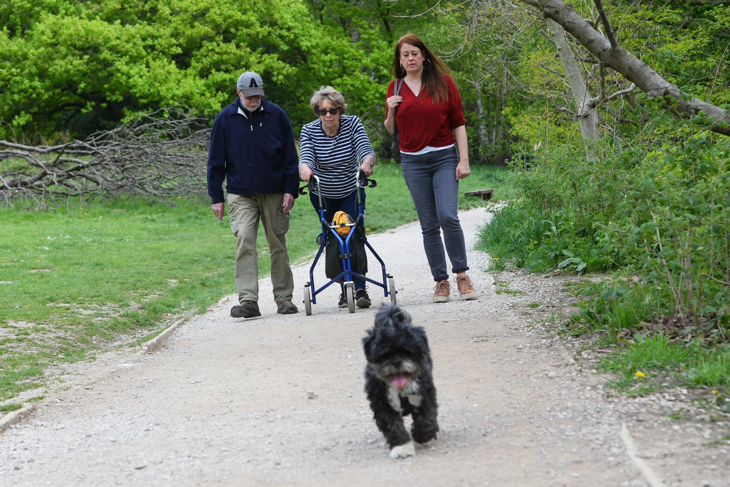
Maecare’s aim is to support older people to have the best quality of life and to live independently for as long as possible
They focus on: Loneliness and isolation, mental and physical health and community involvement.
Situated in Cramner Banks in North Leeds, Maecare has a catchment area that includes Moor Allerton, Moortown, Alwoodley and Shadwell. With an above average elderly population, some living with dimentia and others living alone, Meacare provides a lifeline for members of the community in most need of a place to go and meet others.
Groups available are for such interests as art, IT skills, walking football, exercise, nostalgia and bingo. All such groups provide the elderly community to meet up, share life experiences and enjoy coffee and busuits. There is even a lunch club who enjoy a meal at a local restaurant each month.
A new meaningful logo with people centred photography
I have provided Maecare with a new, meaningful logo that reflects the purpose of the charity. The initial capital 'M for Maecare represents the coming together of two individuals. The shaking of hands is the connection we make when greeting others and is the sole purpose of the charity. Bringing people together. ‘Everyone Cares’ is Maecare way of expressing inclusivity. All are welcome.
A new, colourful logo, The M represents the essence of the charity - people meeting
People centred cover - enjoy, share, laugh and learn
I have also completed an extensive suite of people centred photography to show some of the activities provided. A feeling of friendliness, trust and safety are key to attracting users to the centre and it is these images that help deliver the positive message of meeting, sharing and enjoying togetherness. Social engagement has been proven to benefit our overall health and wellbeing and the function of Maecare is to bring people together and to live longer, healthier happier lives.
People centred photography demonstrates trust, care, inclusion and safety for the elderly
Leeds Community Foundation
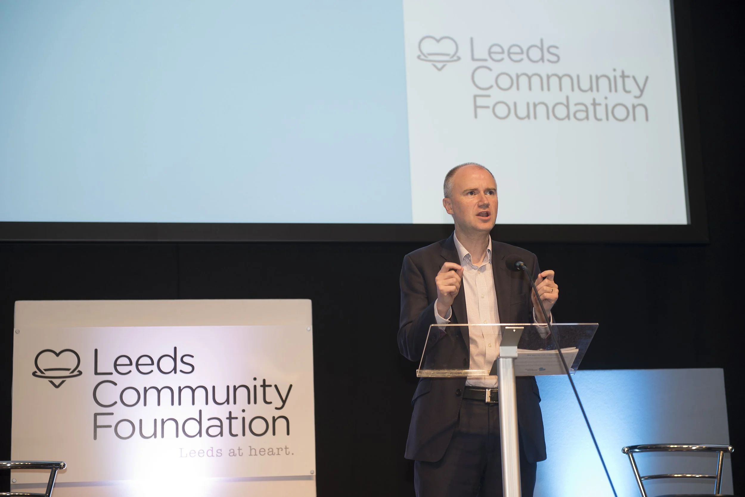
As the region’s largest independent funder, Leeds Community Foundation is the only organisation of its kind in Leeds and Bradford, working with hundreds of Community Organisations each year. The Foundation generates philanthropic giving and leverages statutory funding to deliver grants that address specific challenges. This opens up vulnerable and often marginalised communities to a wealth of opportunities including skills, education, health, culture and employment.
Over several years I completed many photography assignments for Leeds Community Foundation. This type of work is ideal for me. Firstly, it’s about people - my favourite subject. If you are not confident in front of a crowd you have one arm tied behind your back. Secondly, you never really know what you are going to get. It’s fairly unpredictable. Light, space and readiness are all part of the assignment. You have to make the most of any situation. finally, it’s about how you treat people as a general rule that really matters to the success of the assignment. You don’t want to upset anybody. That’s faux pas.
It is crucial to treat everybody the same; polite, courteous, patient and yet instructive. A good people photographer is one who understands their subject and to understand that flexibility, chance and kindness are all vital to the work. Being quick helps too!
These images are great for press and social media. Everybody loves a story and if I can help tell that story then I have fulfilled the brief.
In Summary
Charity and third sector organisations are fantastic people to work with. Their genuine passion, care and commitment to the cause is always incredibly high and the willingness to help others is overwhelming.
Charity is more budget sensitive. Thats ok. It has to be.
However, all charities deserve a fantastic creative design and marketing service when procured. The creative sector is there to be used well and there are plenty of creatives out there who will share the passion, kindness and spirit that the charity sector brings.


